Dear lazyweb: How would you visualize..?
Dear lazyweb,
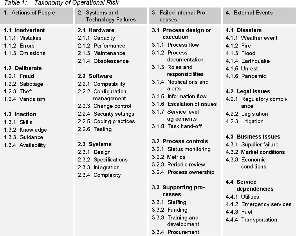
I am trying to get a good way to present the categorization of several cases studied with a fitting graph. I am rating several vulnerabilities / failures according to James Cebula et. al.’s paper, A taxonomy of Operational Cyber Security Risks; this is a somewhat deep taxonomy, with 57 end items, but organized in a three levels deep hierarchy. Copying a table from the cited paper (click to display it full-sized):
My categorization is binary: I care only whether it falls within a given category or not. My first stab at this was to represent each case using a star or </em>radar</em> graph. As an example:
As you can see, to a “bare” star graph, I added a background color for each top-level category (blue for actions of people, green for systems and technology failures), red for failed internal processes and gray for external events), and printed out only the labels for the second level categories; for an accurate reading of the graphs, you have to refer to the table and count bars. And, yes, according to the Engineering Statistics Handbook:
Star plots are helpful for small-to-moderate-sized multivariate data sets. Their primary weakness is that their effectiveness is limited to data sets with less than a few hundred points. After that, they tend to be overwhelming.
I strongly agree with the above statement — And stating that “a few hundred points” can be understood is even an overstatement. 50 points are just too much. Now, trying to increase usability for this graph, I came across the Sunburst diagram. One of the proponents for this diagram, John Stasko, has written quite a bit about it.
Now… How to create my beautiful Sunburst diagram? That’s a tougher one. Even though the page I linked to in the (great!) Data visualization catalogue presents even some free-as-in-software tools to do this… They are Javascript projects that will render their beautiful plots (even including an animation)… To the browser. I need them for a static (i.e. to be printed) document. Yes, I can screenshot and all, but I want them to be automatically generated, so I can review and regenerate them all automatically. Oh, I could just write JSON and use SaaS sites such as Aculocity to do the heavy-lifting, but if you know me, you will understand why I don’t want to.
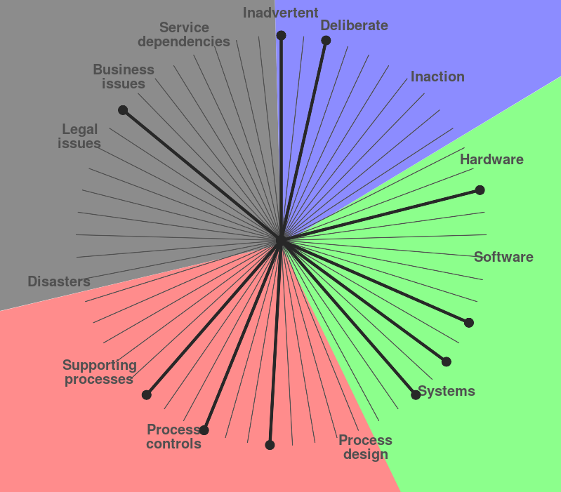
So… I set out to find a Gunnar-approved way to display the information I need. Now, as the Protovis documentation says, an icicle is simply a sunburst transformed from polar to cartesian coordinates… But I came to a similar conclusion: The tools I found are not what I need. OK, but an icicle graph seems much simpler to produce — I fired up my Emacs, and started writing using <a href=” After some hours fiddling with Ruby, RMagick and RVG… I decided to try a different way. This is my result so far:

So… What do you think? Does this look right to you? Clearer than the previous one? Worst? Do you have any idea on how I could make this better?
Oh… You want to tell me there is something odd about it? Well, yes, of course! I still need to tweak it quite a bit. Would you believe me if I told you this is not really a left-to-right icicle graph, but rather a strangely formatted Graphviz non-directed graph using the dot formatter?
I can assure you you don’t want to look at my Graphviz sources… But in case you insist… Take them and laugh. Or cry. Of course, this file comes from a hand-crafted template, but has some autogenerated bits to it. I have still to tweak it quite a bit to correct several of its usability shortcomings, but at least it looks somewhat like what I want to achieve.
Anyway, I started out by making a “dear lazyweb” question. So, here it goes: Do you think I’m using the right visualization for my data? Do you have any better suggestions, either of a graph or of a graph-generating tool?
Thanks!
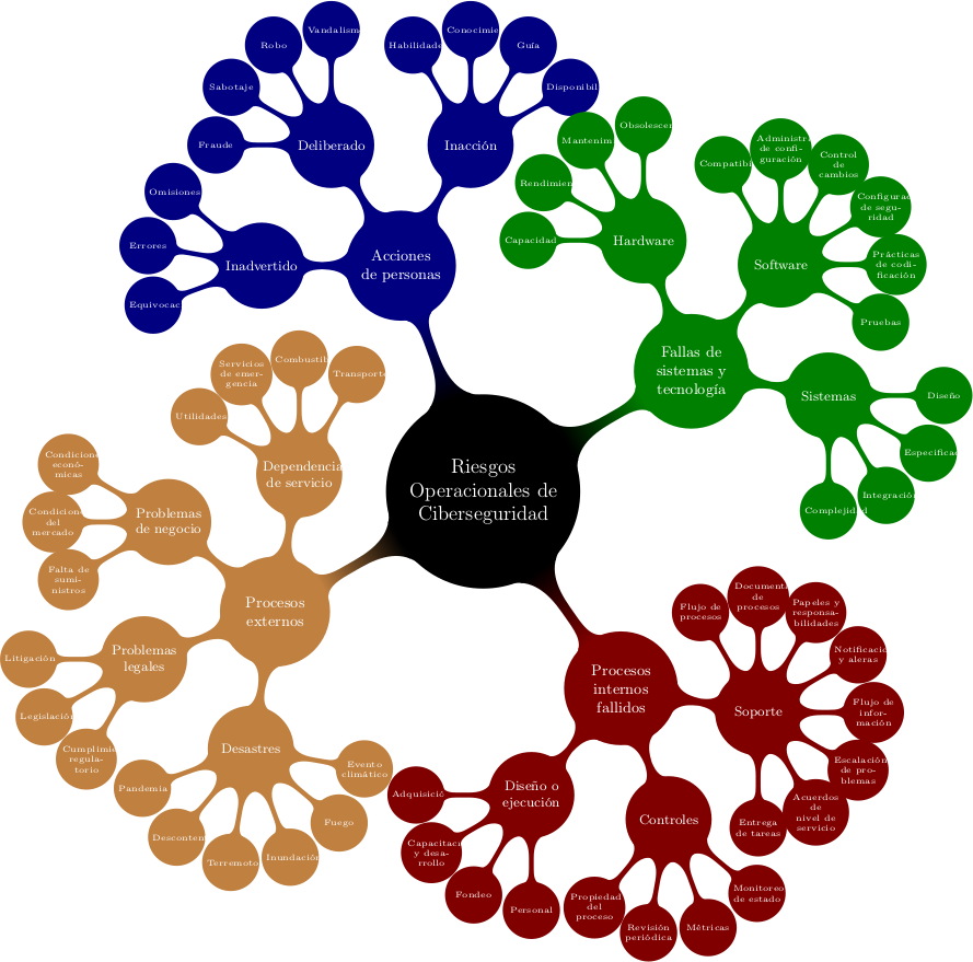
[update] Thanks for the first pointer, Lazyweb! I found a beautiful solution; we will see if it is what I need or not (it is too space-greedy to be readable… But I will check it out more thoroughly). It lays out much better than anything I can spew out by myself — Writing it as a mindmap using TikZ directly from within LaTeX, I get the following result:
Attachments
3.png (185 KB)
3.txt (6 KB)
new-3.scale_.png (90 KB)
ROdC.png (207 KB)
ROdC.tex (5 KB)
taxonomy_oper_risk.png (129 KB)
Comments
gwolf 2017-03-24 17:34:00
Quoting a conversation…
Oh, laziest of all lazywebs! A fellow Debian friend contacted me on IRC. I’m reproducing the chat here, as it’s easier for me to refer to :-]
friend| I'm a bit surprised nobody did anything like that in PGF/TikZ friend| this, however, is a bit close: http://www.texample.net/tikz/examples/servers/ gwolf | It sounds quite easy to do! gwolf | Yes... Well, there are many ways of presenting hierarchical information gwolf | However, what I'd like to have is something that allows for quickly seeing the "shape" of a case — on/off gwolf | Of course, the example you show me could also be perfectly used for that :) gwolf | (having different backgrounds, just as I'm using) gwolf | ...And I guess the syntactic idea it presents is quite homeomorphic with what I need... friend| there's also http://www.texample.net/tikz/examples/title-graphics/ friend| and http://www.texample.net/tikz/examples/computer-science-mindmap/
Thanks! :-]
gwolf 2017-03-26 15:08:33
Using a Treemap
Saw them and thought about it. For my needs, what I want is to visually compare the different cases - not so much to get easy insight on each one, but to see where they are similar and different.
ironicx 2017-03-25 05:16:00
Since the categories are
Since the categories are hierarchical, what about a treemap chart (https://en.m.wikipedia.org/wiki/Treemap)?